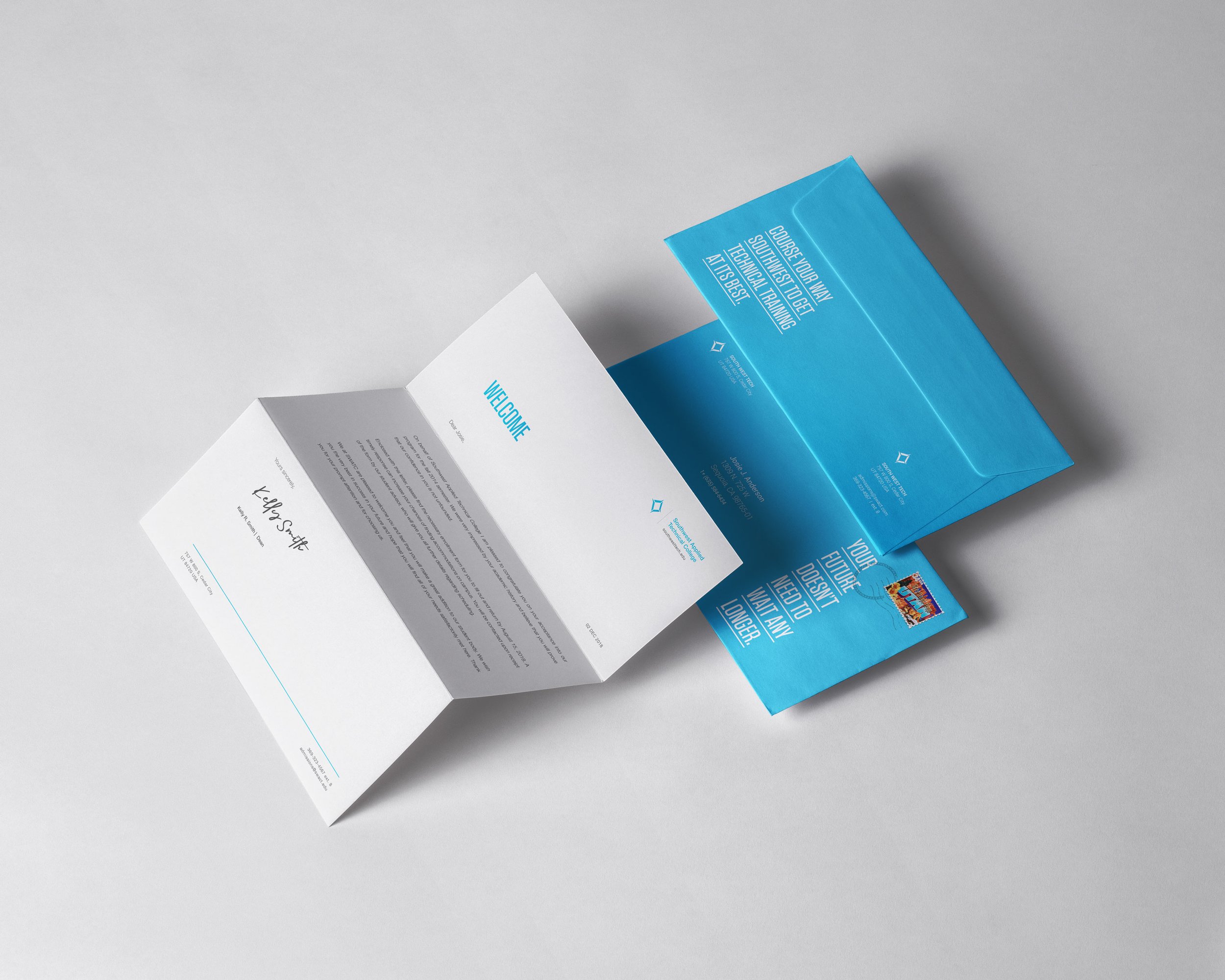
southwest applied technology college branding
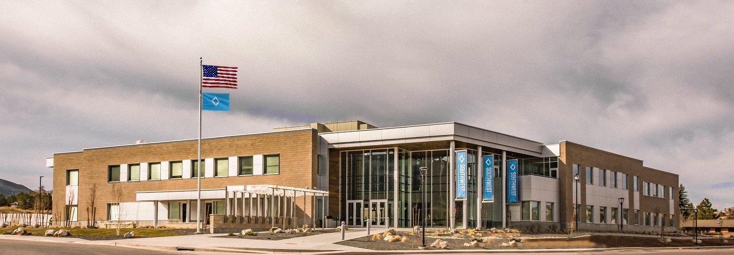
Southwest started with humble beginnings until inspired educators were put into place and convinced the state to expand and provide technical training to those in smaller spread out communities of Southwest Utah. A new building was constructed while the branding process took place.
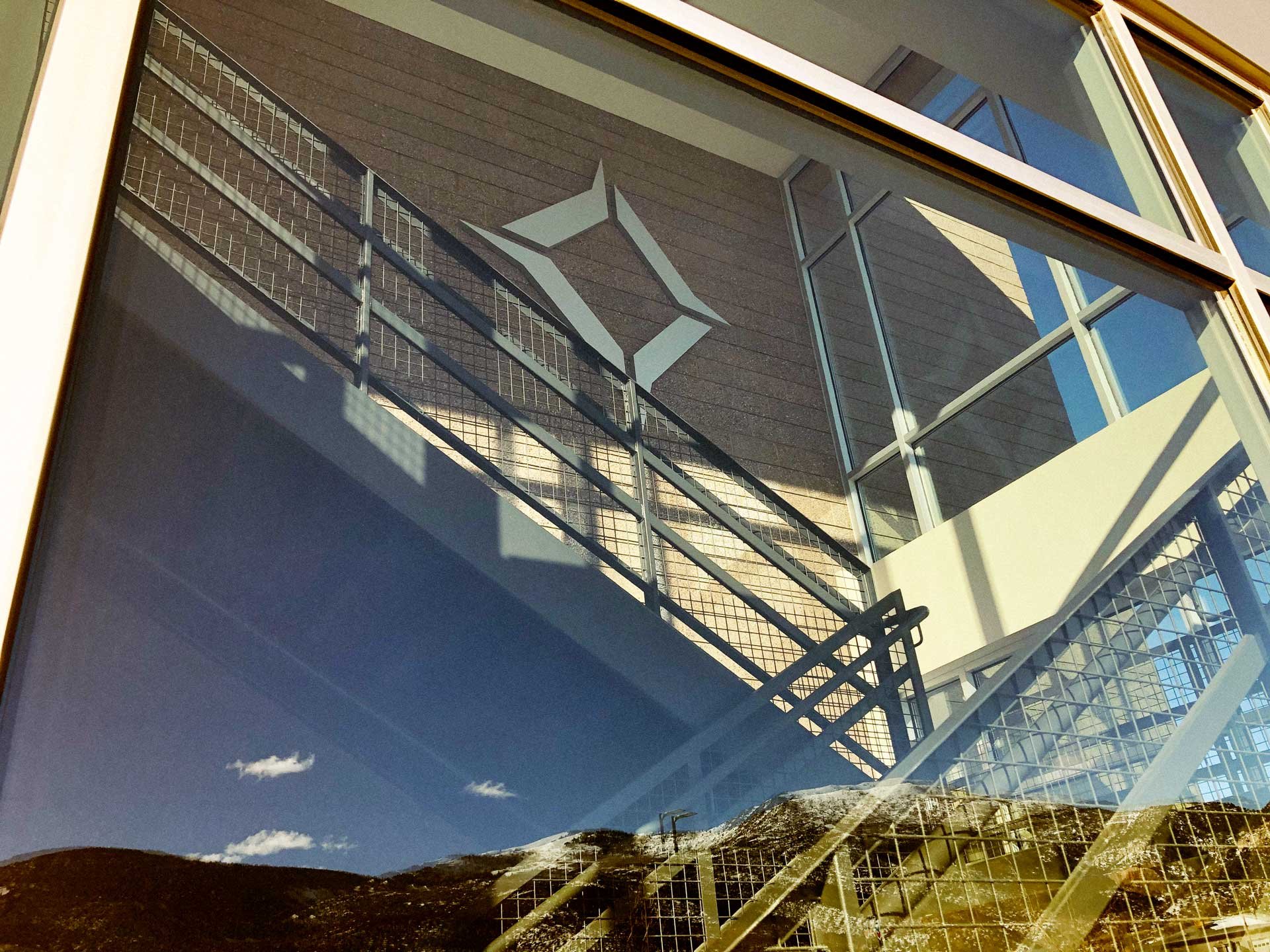
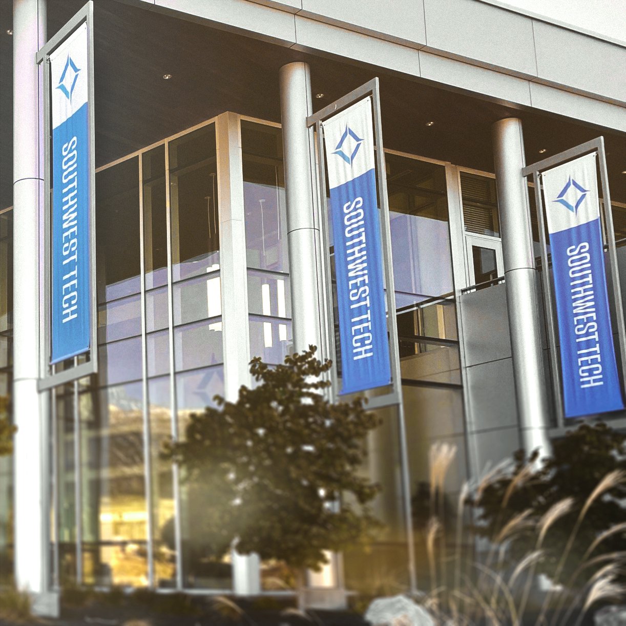
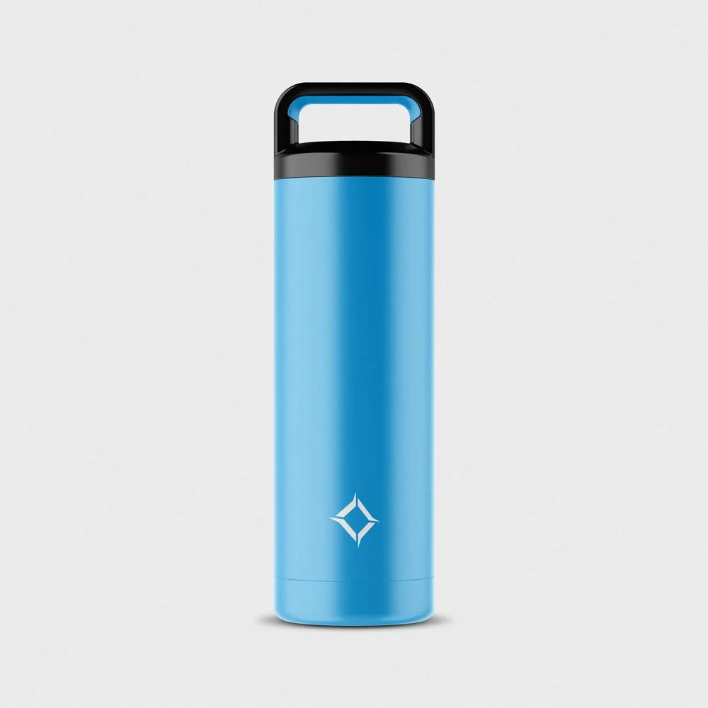
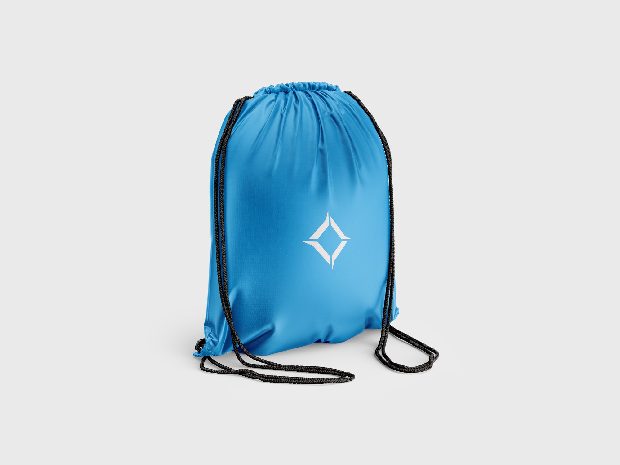
The client wanted to emphasize that a technical college is only the beginning of one's career and academics—a huge stepping stone towards independence with a debt free education. This is where the logo concept comes into play. I created a compass like element with emphasis on the southwest corner. Having a sharp triangular shape divided into sections, the solution was inspired by southwest Native American culture.
The color blue was selected to represent the brand because of its strong association with the technology industry—with that it works as a complementary color to the landscape of southern Utah.
Agency Fluid with Ryan Anderson
Role Art Direction, Design and Copy